Watchlist
Watchlist
Watchlist
Company
eBay
Company
eBay
Role
UI/UX Designer
Scope
Experience replatforming
Scope
Replatforming
Duration
November – December, 2017
Duration
Nov – Dec, 2017
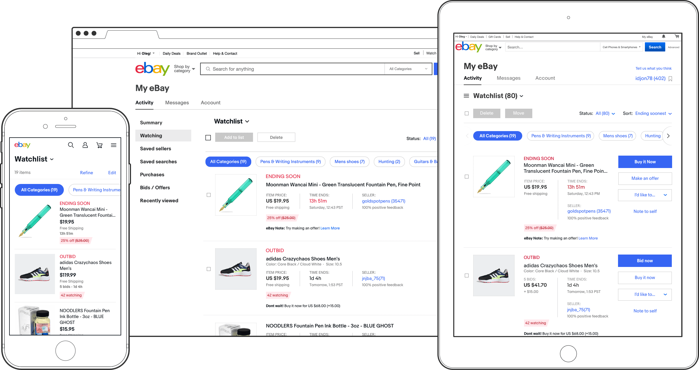
Watchlist is eBay's primary shopping tool used by 32M unique desktop users and 45M unique mobile users yearly. People save listings to Watchlist to receive important notifications on price and availability changes, comparing similar items, keeping an eye on auction dynamics, and discovering market value and demand.
Watchlist is eBay's primary shopping tool used by 32M unique desktop users and 45M unique mobile users yearly. People save listings to Watchlist to receive important notifications on price and availability changes, comparing similar items, keeping an eye on auction dynamics, and discovering market value and demand.
Background
Background
Watchlist is an integral part of My eBay. My eBay is an environment where users not only keep track of items they consider buying, commit to buy, and things they have already bought, but also a place where they sell, communicate with other eBay users, and access their account settings. While new features have been added over time, the desktop version of My eBay hasn't been touched by a Designer for over 15 years due to the following factors: vocal change-opposing users, a highly inefficient Raptor platform, lack of resources and an abundance of higher priority initiatives. The recent redesign of the Purchase History page has demonstrated the advantages of Node.js over Raptor stack and led to a replatforming initiative of the entire My eBay starting with the second most used page – Watchlist.
Watchlist is an integral part of My eBay. My eBay is an environment where users not only keep track of items they consider buying, commit to buy, and things they have already bought, but also a place where they sell, communicate with other eBay users, and access their account settings. While new features have been added over time, the desktop version of My eBay hasn't been touched by a Designer for over 15 years due to the following factors: vocal change-opposing users, a highly inefficient Raptor platform, lack of resources and an abundance of higher priority initiatives. The recent redesign of the Purchase History page has demonstrated the advantages of Node.js over Raptor stack and led to a replatforming initiative of the entire My eBay starting with the second most used page – Watchlist.

Old Watch List
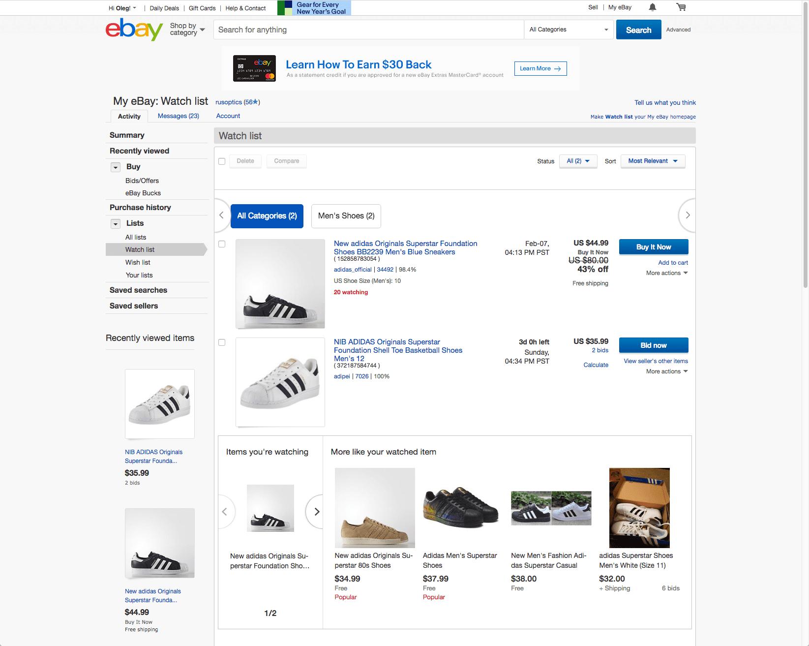
Old Watch List
The visibly aged old Watch List page demonstrated poor hierarchy, broken UI and a heavy information density.
The visibly aged old Watch List page demonstrated poor hierarchy, broken UI and a heavy information density.
New Watchlist
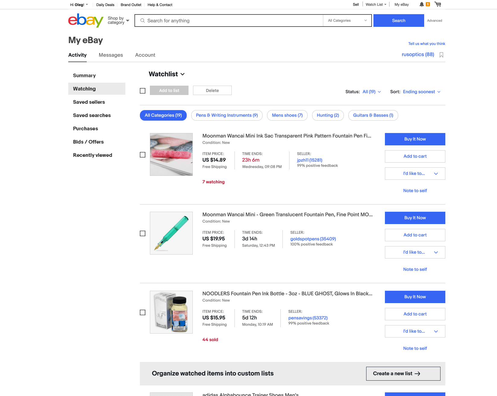
The modernized new Watchlist shows a significant improvement in page structure, clarity and consumability. The new stack allows pushing updates faster and with much lesser effort.
The modernized new Watchlist shows a significant improvement in page structure, clarity and consumability. The new stack allows pushing updates faster and with much lesser effort.
Old Watch List
v.1 Original Design
The visibly aged old Watch List page demonstrated poor hierarchy, broken UI and a heavy information density.
The original design featured a card-based masonry editorial layout that could be easily customized by the Collection Creator inside the edit mode. An endcap consisting of related Collections and Buying Guides allowed for further exploration of the same topic.
New Watchlist
v.1 Original Design
The modernized new Watchlist shows a significant improvement in page structure, clarity and consumability. The new stack allows pushing updates faster and with much lesser effort.
The modernized new Watchlist shows a significant improvement in page structure, clarity and consumability. The new stack allows pushing updates faster and with much lesser effort.
The original design featured a card-based masonry editorial layout that could be easily customized by the Collection Creator inside the edit mode. An endcap consisting of related Collections and Buying Guides allowed for further exploration of the same topic.
Because the replatforming effort involved rebuilding the entire page from scratch, we couldn't bypass an opportunity to adopt a newly introduced Design System 6 (DS6). Due to lack of solid knowledge about user pain points, we could not risk any major change to user experience besides reskinning the existing page; however, based on CTR analysis, we took the liberty in deprecating some of the underperforming areas such as the listing comparison tool and sponsored listings recommendation module. My team and I meticulously scrutinized every aspect of the “watching” experience allowing us to weed out redundancy and improve UI content. For example, it didn't escape our attention that “Watch List” as a list title didn't resonate with new users, but at the same time this naming convention had too much equity to rename it. We solved this problem by introducing a synthetic word “Watchlist” which was well received by new and established users.
Because the replatforming effort involved rebuilding the entire page from scratch, we couldn't bypass an opportunity to adopt a newly introduced Design System 6 (DS6). Due to lack of solid knowledge about user pain points, we could not risk any major change to user experience besides reskinning the existing page; however, based on CTR analysis, we took the liberty in deprecating some of the underperforming areas such as the listing comparison tool and sponsored listings recommendation module. My team and I meticulously scrutinized every aspect of the “watching” experience allowing us to weed out redundancy and improve UI content. For example, it didn't escape our attention that “Watch List” as a list title didn't resonate with new users, but at the same time this naming convention had too much equity to rename it. We solved this problem by introducing a synthetic word “Watchlist” which was well received by new and established users.

Key issues
Key issues
- Antiquated dotcom era design
- Eclectic structure
- Extra long code change implementation
- Antiquated dotcom era design
- Eclectic structure
- Extra long code change implementation
Unused and underused features
Heavy information density
Inconsistency with mobile experience
- Unused and underused features
- Heavy information density
- Inconsistency with mobile experience

My role
My role
UI/UX Designer: Worked with the Analytics team to sift through user feedback to gather as much information about Watchlist as possible. Analyzed all information on the page to find as many areas for improvement as possible. Outlined and enacted criteria for project design success. Layed out a new page, and cleaned the UI. Communicated our efforts to the greater design team at weekly design reviews and collected valuable feedback. Assisted product developers to ensure the most accurate translation of design specifications to code. Closely followed page performance during the partial roll out.
Product Evangelist: Routinely communicated the design is progress to the Selling team to get alignment on design evolution of shared UI elements. Kept our Design and Product leadership updated on design decisions made. Was in constant contact with the Platforms team, providing feedback on DS6 improvements and proposing new UI patterns.
UI/UX Designer:
Worked with the Analytics team to sift through user feedback to gather as much information about Watchlist as possible. Analyzed all information on the page to find as many areas for improvement as possible. Outlined and enacted criteria for project design success. Layed out a new page, and cleaned the UI. Communicated our efforts to the greater design team at weekly design reviews and collected valuable feedback. Assisted product developers to ensure the most accurate translation of design specifications to code. Closely followed page performance during the partial roll out.
Product Evangelist:
Routinely communicated the design is progress to the Selling team to get alignment on design evolution of shared UI elements. Kept our Design and Product leadership updated on design decisions made. Was in constant contact with the Platforms team, providing feedback on DS6 improvements and proposing new UI patterns.

Challenges
Challenges
Multiple ownerships & dependencies: resolving shared navigation, functionality and UI elements, synchronization of design efforts to raise awareness and ensure design and UX consistency, putting multiple stakeholders in the same room.
Early adoption of Design System 6: lack of ready to use design components, substantial difference from the legacy design systems, keeping track of constantly changing/evolving design elements.
Legacy: auditing and analyzing existing UI components and features, making calculated decisions when removing, adding or modifying UI elements, preventing harm while maximizing the value of new design, evangelizing new design while retaining a familiar experience.
Multiple ownerships & dependencies:
resolving shared navigation, functionality and UI elements, synchronization of design efforts to raise awareness and ensure design and UX consistency, putting multiple stakeholders in the same room.
Early adoption of Design System 6:
lack of ready to use design components, substantial difference from the legacy design systems, keeping track of constantly changing/evolving design elements.
Legacy:
auditing and analyzing existing UI components and features, making calculated decisions when removing, adding or modifying UI elements, preventing harm while maximizing the value of new design, evangelizing new design while retaining a familiar experience.

Design tenets
Design tenets
- Modernize the page without breaking user experience
- Add clarity, remove clutter
- Follow best practices and industry standards without losing own identity
- Influence other design teams to embrace the new design system
- Elevate eBay's brand experience by designing useful and usable product
- Modernize the page without breaking user experience
- Add clarity, remove clutter
- Follow best practices and industry standards without losing own identity
- Influence other design teams to embrace the new design system
- Elevate eBay's brand experience by designing useful and usable product
- Modernize the page without breaking user experience
- Add clarity, remove clutter
- Follow best practices and industry standards without losing own identity
- Influence other design teams to embrace the new design system
- Elevate eBay's brand experience by designing useful and usable product
Layout
Layout
The new layout demonstrates a substantial evolution towards simplicity and clarity making the user experience more focused and efficient. This was achieved by the adoption of a more open, bigger and bolder visual language of Design System 6 as well as by the optimization of UI elements and content elements on the page.
The new layout demonstrates a substantial evolution towards simplicity and clarity making the user experience more focused and efficient. This was achieved by the adoption of a more open, bigger and bolder visual language of Design System 6 as well as by the optimization of UI elements and content elements on the page.
Page tabs
Page tabs
How could we improve the My eBay level tabs experience across four different domains?
How could we improve the My eBay level tabs experience across four different domains?
–
After consultations with the Selling, Identity and M2M teams, we agreed upon removing all tabs-associated dropdowns across the entirety of My eBay.
After consultations with the Selling, Identity and M2M teams, we agreed upon removing all tabs-associated dropdowns across the entirety of My eBay.


Old tabs
Old tabs
Both dropdowns associated with the Activity and Messages tabs reflected an older content structure inside these tabs. Consisting of four items, the Activity tab dropdown underrepresented My eBay Activity by 8 items (see old Left Hand Nav). The tab UI did not communicate dropdown presence. Because the click through rate (CTR) for these dropdowns did not exceed the noise, we assumed this was a leftover feature and a part of the design debt needing to be removed.
Both dropdowns associated with the Activity and Messages tabs reflected an older content structure inside these tabs. Consisting of four items, the Activity tab dropdown underrepresented My eBay Activity by 8 items (see old Left Hand Nav). The tab UI did not communicate dropdown presence. Because the click through rate (CTR) for these dropdowns did not exceed the noise, we assumed this was a leftover feature and a part of the design debt needing to be removed.

New tabs
After aligning with partner teams who were using this tabbed navigation module, we removed the dropdowns. In addition to the dropdowns removal, “Watch List” was deleted from the “My eBay” headline because it was already present above the content container. A clear My eBay headline complimented by DS6 conversion helped to reestablish page hierarchy.
After aligning with partner teams who were using this tabbed navigation module, we removed the dropdowns. In addition to the dropdowns removal, “Watch List” was deleted from the “My eBay” headline because it was already present above the content container. A clear My eBay headline complimented by DS6 conversion helped to reestablish page hierarchy.
Left hand navigation
Left hand navigation
How could we improve left hand navigation performance?
How could we improve left hand navigation performance?
–
The alignment of the desktop experience with our native app My eBay navigation has helped to improve discoverability and usability of the left hand navigation.
The alignment of the desktop experience with our native app My eBay navigation has helped to improve discoverability and usability of the left hand navigation.
Old LHN
(default view)
Old LHN
(default view)
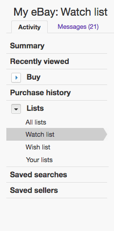
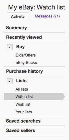
The Watchlist was located inside the Lists accordion within the old LHN. Custom Lists was a deprecated feature that was available only to legacy users.
The Watchlist was located inside the Lists accordion within the old LHN. Custom Lists was a deprecated feature that was available only to legacy users.
Old LHN
(fully expanded)
Old LHN
(fully expanded)
The Buy accordion group (collapsed by default) contained two other critical pages with high conversion rate – Bids & Offers and eBay Bucks.
The Buy accordion group (collapsed by default) contained two other critical pages with high conversion rate – Bids & Offers and eBay Bucks.
Old LHN
(collapsed view)
Old LHN
(collapsed view)
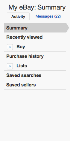
The collapsing of the Lists accordion led to a spontaneous loading of the Summary page. Apparently, this was a feature and not a bug.
The collapsing of the Lists accordion led to a spontaneous loading of the Summary page. Apparently, this was a feature and not a bug.
New LHN
New LHN
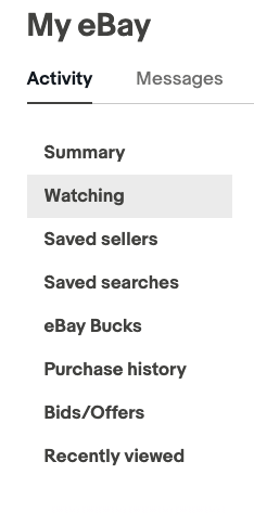
The New LHN features fully align with eBay native apps. All accordions and bizarre interactions were removed and the contents were rearranged.
The New LHN features fully align with eBay native apps. All accordions and bizarre interactions were removed and the contents were rearranged.
We learned from analytics that the vast majority of users use the My eBay dropdown within the global header to navigate between different pages. Originally, we considered removing the entire LHN and expanding the content container; however two major concerns held us back from taking this action. Firstly, we needed an alternative navigation for accessibility purposes. Secondly, the selling side of My eBay heavily relies on LHN because of an entirely different set of tools within their version of LHN. This left us with the only viable solution to fall back on native version of the LHN, which performed well due to its simplicity. The simplification of the LHN UI and usability fixes improved engagement.
We learned from analytics that the vast majority of users use the My eBay dropdown within the global header to navigate between different pages. Originally, we considered removing the entire LHN and expanding the content container; however two major concerns held us back from taking this action. Firstly, we needed an alternative navigation for accessibility purposes. Secondly, the selling side of My eBay heavily relies on LHN because of an entirely different set of tools within their version of LHN. This left us with the only viable solution to fall back on native version of the LHN, which performed well due to its simplicity. The simplification of the LHN UI and usability fixes improved engagement.
Custom lists
How could we help power users to keep track of more items beyond Watchlist capacity?
How could we help power users to keep track of more items beyond Watchlist capacity?
–
The reintroduction of the Custom Lists experience empowered high volume watchers to keep track of more items in an organized fashion.
The reintroduction of the Custom Lists experience empowered high volume watchers to keep track of more items in an organized fashion.
Old custom lists
Old custom lists
Old custom lists
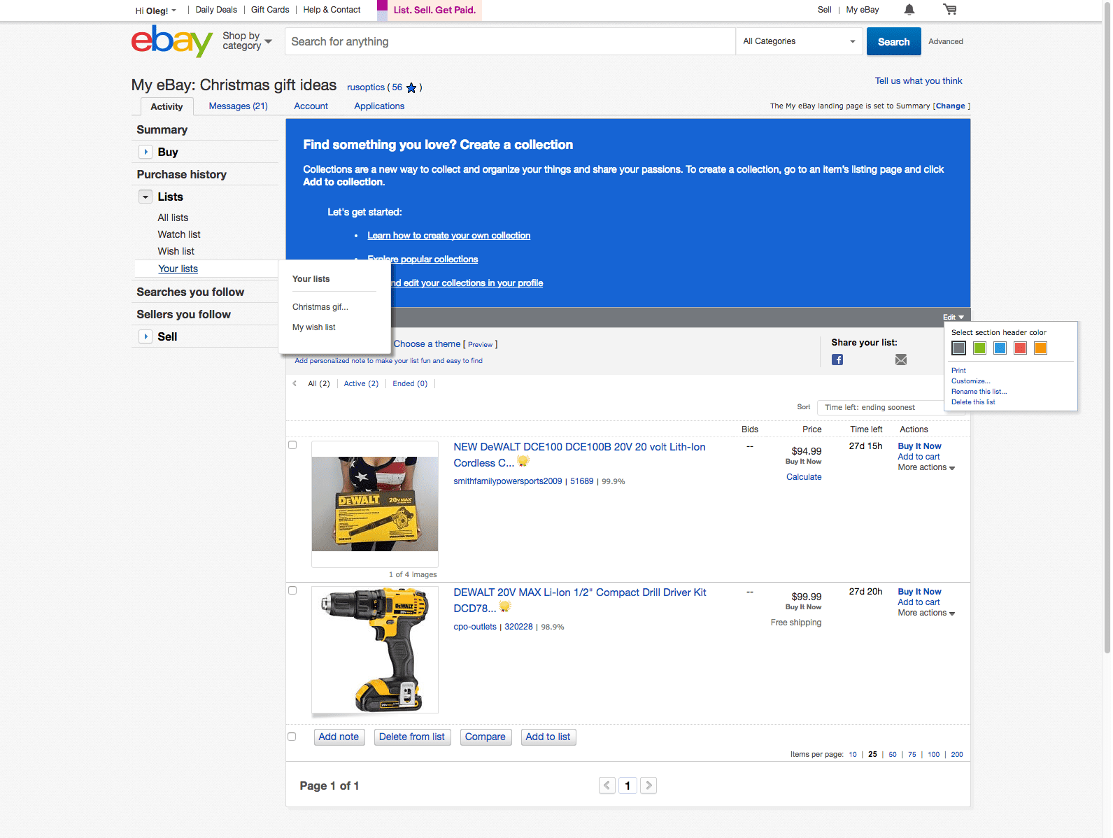
With the introduction of the eBay Collections experience, the Custom Lists feature was deprecated; however, established users with at least one custom list were grandfathered. Because the Collections experience was defunct for some time, many users were limited to a Watchlist with only a 200 item capacity. The old Custom Lists UI demonstrates an unnecessary complexity in regards to UI and interaction experience. The large blue info banner advising users to adopt a no longer existing feature was a graphic demonstration of design and technical debt.
With the introduction of the eBay Collections experience, the Custom Lists feature was deprecated; however, established users with at least one custom list were grandfathered. Because the Collections experience was defunct for some time, many users were limited to a Watchlist with only a 200 item capacity. The old Custom Lists UI demonstrates an unnecessary complexity in regards to UI and interaction experience. The large blue info banner advising users to adopt a no longer existing feature was a graphic demonstration of design and technical debt.
New custom lists
New custom lists
New custom lists
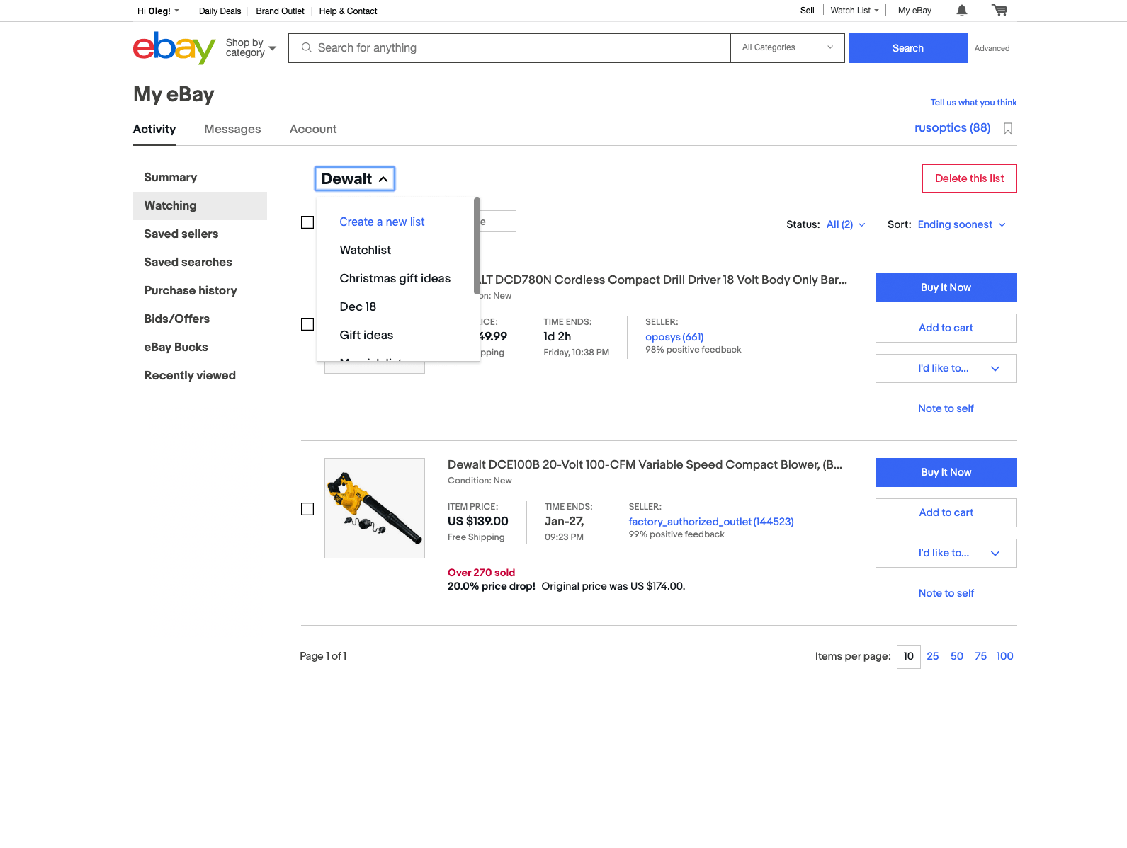
Because we were already spending resources to maintain the old Custom Lists for grandfathered users, it did not cost us much to reintroduce this feature for all users. In an effort to simplify LHN, the custom lists navigation was evolved from the flyout from inside an expanded accordion menu item to title dropdown. To compensate for the hidden nature of the title dropdown pattern, we introduced educational moments: informational tips pointing to the location of custom lists and a feature marketing banner located below the third tile in Watchlist.
Because we were already spending resources to maintain the old Custom Lists for grandfathered users, it did not cost us much to reintroduce this feature for all users. In an effort to simplify LHN, the custom lists navigation was evolved from the flyout from inside an expanded accordion menu item to title dropdown. To compensate for the hidden nature of the title dropdown pattern, we introduced educational moments: informational tips pointing to the location of custom lists and a feature marketing banner located below the third tile in Watchlist.
Old custom lists
With the introduction of the eBay Collections experience, the Custom Lists feature was deprecated; however, established users with at least one custom list were grandfathered. Because the Collections experience was defunct for some time, many users were limited to a Watchlist with only a 200 item capacity. The old Custom Lists UI demonstrates an unnecessary complexity in regards to UI and interaction experience. The large blue info banner advising users to adopt a no longer existing feature was a graphic demonstration of design and technical debt.
New custom lists
Because we were already spending resources to maintain the old Custom Lists for grandfathered users, it did not cost us much to reintroduce this feature for all users. In an effort to simplify LHN, the custom lists navigation was evolved from the flyout from inside an expanded accordion menu item to title dropdown. To compensate for the hidden nature of the title dropdown pattern, we introduced educational moments: informational tips pointing to the location of custom lists and a feature marketing banner located below the third tile in Watchlist.
Content container header
How could we align the content container header with other changes on the page?
How could we align the content container header with other changes on the page?
–
The reevaluation of the user interface and features of the content container header has helped to establish a more focused and useful experience.
Old content container header
Old content container header
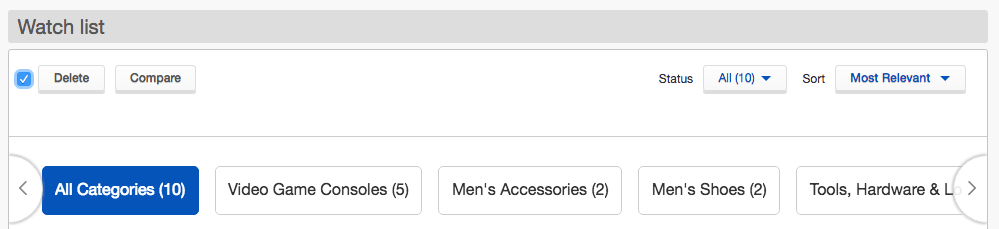
We identified the following problems with the content container header: Delete and Compare actions were virtually indistinguishable from Status and Sort dropdowns, multiple horizontal visual dividers and UI elements were creating visual noise and making the UI tiring for users, the destructive Delete action had the same treatment as the non-destructive Compare action.
We identified the following problems with the content container header: Delete and Compare actions were virtually indistinguishable from Status and Sort dropdowns, multiple horizontal visual dividers and UI elements were creating visual noise and making the UI tiring for users, the destructive Delete action had the same treatment as the non-destructive Compare action.
New content container header
New content container header
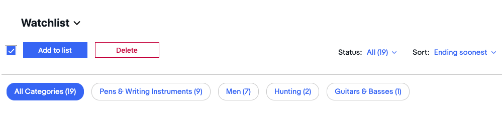
According to the CTR metric, the comparison tool had extremely low engagement. The evaluation of this tool demonstrated that it was comparing listing features (time left, listing formats, sellers prices, shipping cost and return details) and not the products themselves. Because most of these comparison categories were no longer relevant for the modern eBay and other comparison categories (such as prices) were visible directly from the Watchlist, we decided to remove this feature. With reintroduction of Custom Lists, the “Add to list” action was inserted on the first position of the button group and the “Delete” action was pushed into position of the deprecated “Compare” action. The “Status” and “Sort” dropdowns received a frameless treatment, which worked well with the labels and made these tools more distinguishable from the button group. After applying DS6 treatment, the user could now clearly see four different sets of UI elements: title dropdown, action group, sorting/filtering group and category pills group.
According to the CTR metric, the comparison tool had extremely low engagement. The evaluation of this tool demonstrated that it was comparing listing features (time left, listing formats, sellers prices, shipping cost and return details) and not the products themselves. Because most of these comparison categories were no longer relevant for the modern eBay and other comparison categories (such as prices) were visible directly from the Watchlist, we decided to remove this feature. With reintroduction of Custom Lists, the “Add to list” action was inserted on the first position of the button group and the “Delete” action was pushed into position of the deprecated “Compare” action. The “Status” and “Sort” dropdowns received a frameless treatment, which worked well with the labels and made these tools more distinguishable from the button group. After applying DS6 treatment, the user could now clearly see four different sets of UI elements: title dropdown, action group, sorting/filtering group and category pills group.
Item tiles
How could we improve item tiles so that the user may faster parse the information and act on it?
How could we improve item tiles so that the user may faster parse the information and act on it?
–
A number of content improvement actions were taken to reestablish informational hierarchy leading to clear separation actions from the rest of the content.
A number of content improvement actions were taken to reestablish informational hierarchy leading to clear separation actions from the rest of the content.
Old tiles
Old tiles
Old tiles
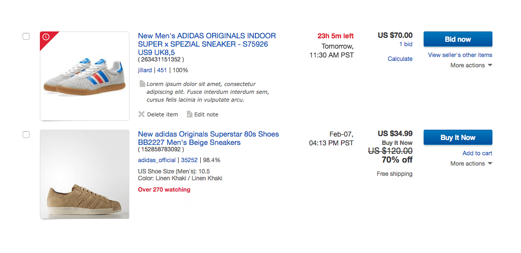
The content inside old tiles distributed information amongst five columns: image, item title with supporting info, listing ending time, price and actions. A wide variety of font treatments and illogical grouping of unrelated elements were hindering scannability.
The content inside old tiles distributed information amongst five columns: image, item title with supporting info, listing ending time, price and actions. A wide variety of font treatments and illogical grouping of unrelated elements were hindering scannability.
New tiles
New tiles
New tiles
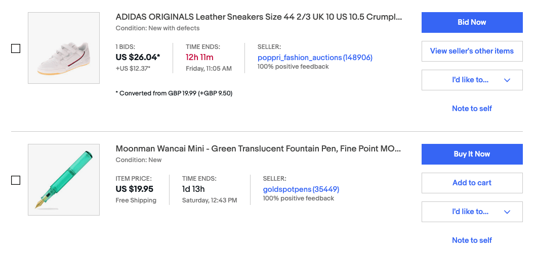
Per new tile treatment, the structure was simplified down to three columns. All actions were consolidated within the action group at the right side and all on-hover interactions were eliminated from the tile.
Per new tile treatment, the structure was simplified down to three columns. All actions were consolidated within the action group at the right side and all on-hover interactions were eliminated from the tile.
Old tiles
The content inside old tiles distributed information amongst five columns: image, item title with supporting info, listing ending time, price and actions. A wide variety of font treatments and illogical grouping of unrelated elements were hindering scannability.
New tiles
Per new tile treatment, the structure was simplified down to three columns. All actions were consolidated within the action group at the right side and all on-hover interactions were eliminated from the tile.
Watchlist on tablet
How could we make the Watchlist experience usable for tablet users?
–
The introduction of tablet breakpoints and a responsive layout has greatly reduced user pain points.
Before
Before
Before
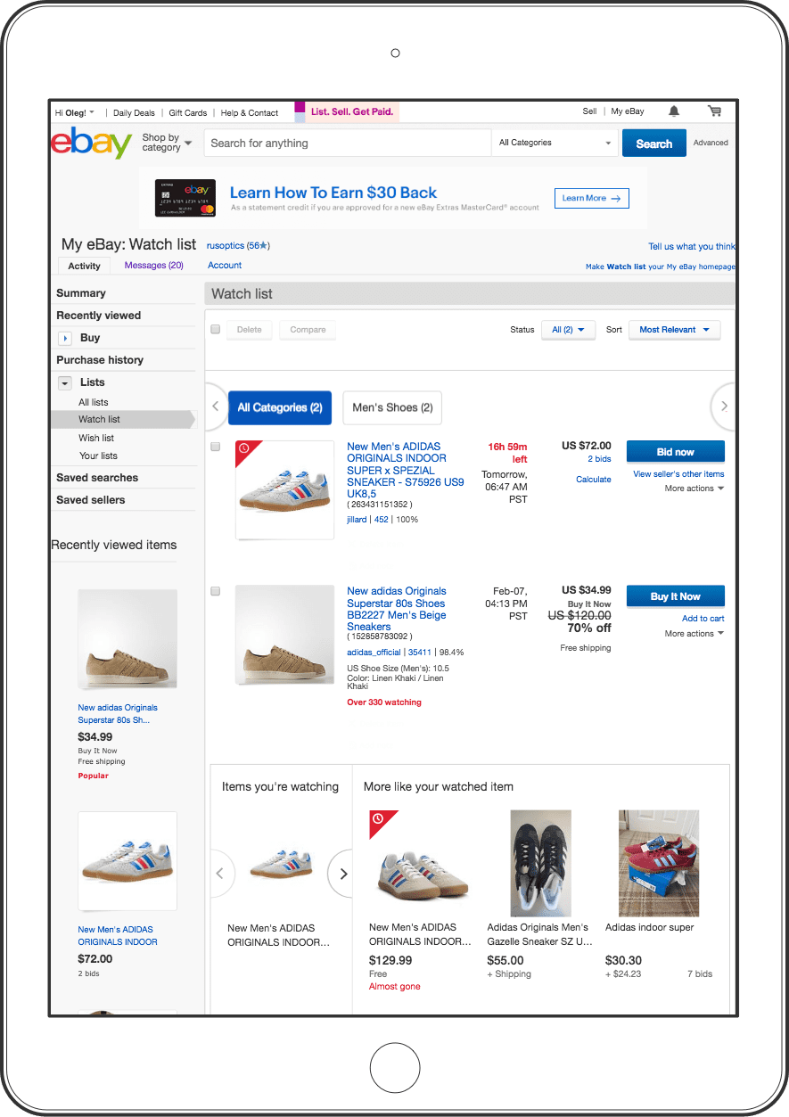
Because the old Watchlist was designed and built far before RWD, tablet users saw a scaled down page forced into the screen. Due to downscaling, multiple actions were unusable, while layout became much denser and less parsable.
Because the old Watchlist was designed and built far before RWD, tablet users saw a scaled down page forced into the screen. Due to downscaling, multiple actions were unusable, while layout became much denser and less parsable.
After
After
After
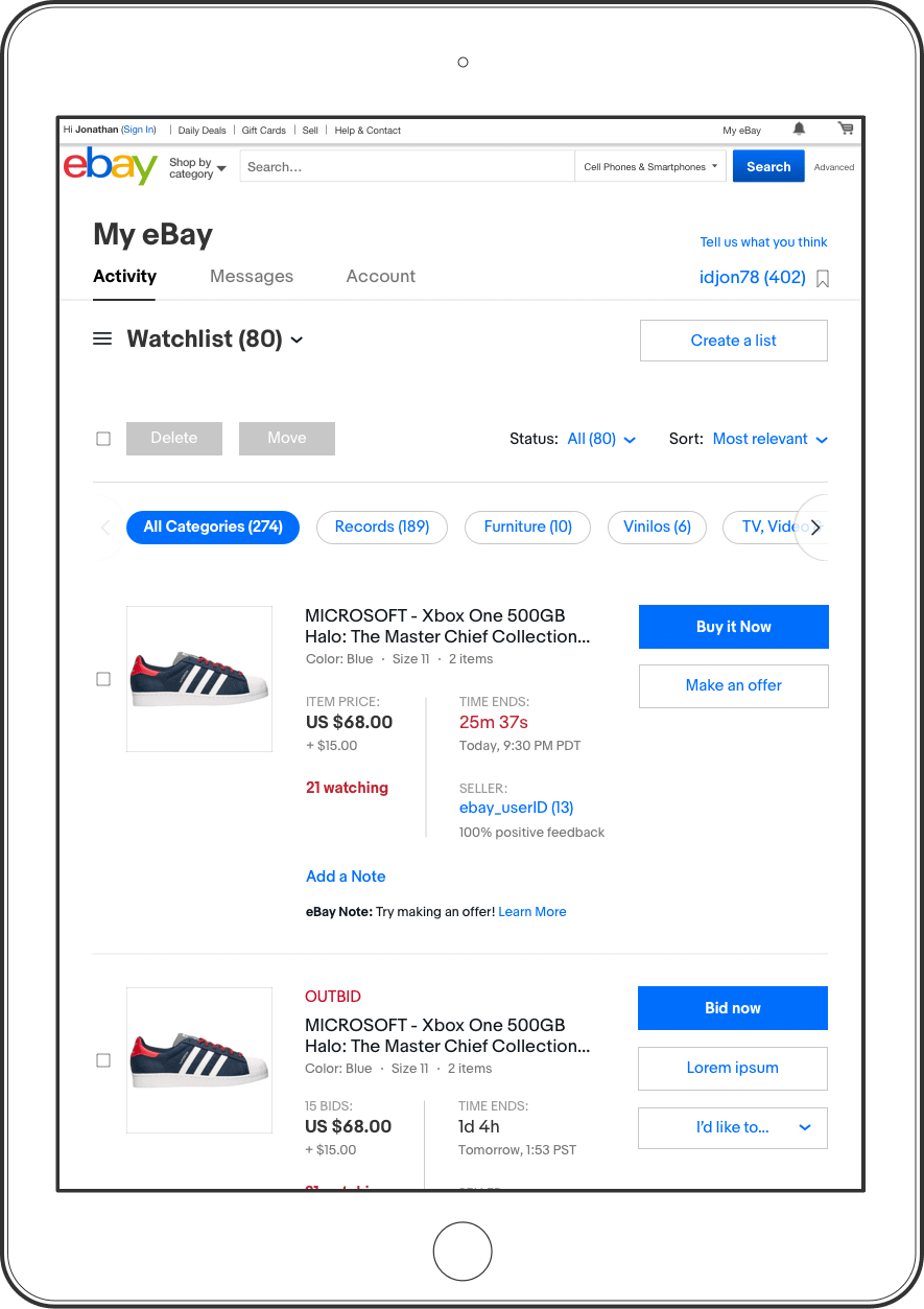
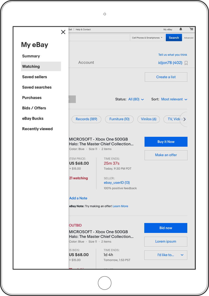
The new layout was designed with a mobile first principle; hence, the content started adapting to any tablet in any orientation. The landscape orientation retained visible LHN, but in portrait orientation it was hidden behind a hamburger menu, next to the title.
The new layout was designed with a mobile first principle; hence, the content started adapting to any tablet in any orientation. The landscape orientation retained visible LHN, but in portrait orientation it was hidden behind a hamburger menu, next to the title.
Before
Because the old Watchlist was designed and built far before RWD, tablet users saw a scaled down page forced into the screen. Due to downscaling, multiple actions were unusable, while layout became much denser and less parsable.
After
The new layout was designed with a mobile first principle; hence, the content started adapting to any tablet in any orientation. The landscape orientation retained visible LHN, but in portrait orientation it was hidden behind a hamburger menu, next to the title.
Watchlist on phone
How could we align the mobile web Watchlist experience with newly designed desktop and native apps experiences?
How could we align the mobile web Watchlist experience with newly designed desktop and native apps experiences?
–
To improve the consistency between mobile web, desktop and native experiences, we applied DS 6 to native style screen layout and functionality.
Before
Before
Before
The old mobile web My eBay was represented only by Watchlist, Purchases, Bids & Offers and Selling pages distributed between three tabs. The Watchlist tiles displayed information in three columns. The font size and overall treatment were no longer compliant with accessibility and our brand standards.
The old mobile web My eBay was represented only by Watchlist, Purchases, Bids & Offers and Selling pages distributed between three tabs. The Watchlist tiles displayed information in three columns. The font size and overall treatment were no longer compliant with accessibility and our brand standards.
After
After
After
Proven usability successes on our native apps allowed us to adopt native functionality and layout treatments. We also applied a new design system and provided item level delete functionality. Because the Custom Lists feature was only used by power users, it was not included in mobile web and native experiences.
Proven usability successes on our native apps allowed us to adopt native functionality and layout treatments. We also applied a new design system and provided item level delete functionality. Because the Custom Lists feature was only used by power users, it was not included in mobile web and native experiences.
Hotness signals
How could we amplify the presence of hotness signals to better communicate discounts, scarcity and popularity of the watched items?
–
After extensive rounds of explorations we landed on a light-red backdrop with a flag-like slanted right side, which gracefully elevated the presence of hotness signals.
After extensive rounds of explorations we landed on a light-red backdrop with a flag-like slanted right side, which gracefully elevated the presence of hotness signals.
New hotness signals
New hotness signals
New hotness signals
After the first release of the new Watchlist, we observed a slight drop in conversion rates on the items with hotness signals. According to our hypothesis, the traditional representation of hotness signals, bold red text below the price, was overpowered by the larger and bolder DS6 elements. It was quite challenging to find a delicate solution that would not be too flashy and at the same time retain relationship with the hotness signals used on different areas of eBay. Once we updated the signals, the conversion metric went back to normal and even increased on the Android app. The next evolutionary stage for hotness signals will be Watchlist awareness.
After the first release of the new Watchlist, we observed a slight drop in conversion rates on the items with hotness signals. According to our hypothesis, the traditional representation of hotness signals, bold red text below the price, was overpowered by the larger and bolder DS6 elements. It was quite challenging to find a delicate solution that would not be too flashy and at the same time retain relationship with the hotness signals used on different areas of eBay. Once we updated the signals, the conversion metric went back to normal and even increased on the Android app. The next evolutionary stage for hotness signals will be Watchlist awareness.
Interactions
Two major interaction updates were focused on redefining the Custom Lists experience and improving of Note to self.
Two major interaction updates were focused on redefining the Custom Lists experience and improving of Note to self.
Two major interaction updates were focused on redefining the Custom Lists experience and improving of Note to self.
Custom lists
How could we find a simple and intuitive substitution for the inefficient old Custom Lists interaction experience?
How could we find a simple and intuitive substitution for the inefficient old Custom Lists interaction experience?
How could we find a simple and intuitive substitution for the inefficient old Custom Lists interaction experience?
–
Besides retaining multiple means to create new lists and populating them with content, we also introduced a dual purpose title which acted as an active list title and list selector.
Creating a new list before adding items
Creating a new list before adding items
This interaction model allows creating a number of new lists from the title dropdown before populating them with content.
This interaction model allows creating a number of new lists from the title dropdown before populating them with content.
Creating a new list while adding items
Creating a new list while adding items
The user may also create a new list while in the process of adding items to a list.
The user may also create a new list while in the process of adding items to a list.
Creating a new list before adding items
This interaction model allows creating a number of new lists from the title dropdown before populating them with content.
Creating a new list while adding items
The user may also create a new list while in the process of adding items to a list.
Adding to custom list from the View Item page
This interaction flow demonstrates how items can be added to a list directly from View Item page.
This interaction flow demonstrates how items can be added to a list directly from View Item page.
Note to self
How could we modernize the note adding experience?
How could we modernize the note adding experience?
–
While updating the user interface, we also improved usability by applying several small changes to the note experience.
While updating the user interface, we also improved usability by applying several small changes to the note experience.
Before
Before
The old note adding experience demonstrates several critical problems and design issues: the “Add a note” notion was often confused with contacting the seller, the proximity to the destructive Delete action was causing accidental deletions, hover state was not the best practice for accessibility and mobile users, a note flyout with a text field was an obsolete pattern, and the flyout reveal was causing the entire page to shift to the right by about 8px.
The old note adding experience demonstrates several critical problems and design issues: the “Add a note” notion was often confused with contacting the seller, the proximity to the destructive Delete action was causing accidental deletions, hover state was not the best practice for accessibility and mobile users, a note flyout with a text field was an obsolete pattern, and the flyout reveal was causing the entire page to shift to the right by about 8px.
After
To avoid ongoing confusion, “Add a note” was replaced with “Note to self.” The location of the note action was moved to the right, below the listing level actions; however, the location of the published note with inline Edit action remained the same. The flyout was transformed into inline input.
To avoid ongoing confusion, “Add a note” was replaced with “Note to self.” The location of the note action was moved to the right, below the listing level actions; however, the location of the published note with inline Edit action remained the same. The flyout was transformed into inline input.
Outcomes & takeaways
The modernization of the Watchlist page has proven to be a success. The updated stack now allows to push updates faster and effortlessly. Having a goal of retaining the same conversion rates upon completion of replatforming, we ended up exceeding our expectations: Watchlist on desktop has gained 1.7% GMV and mobile web went up by 2.85% GMV. The successful outcome of the redesign has convinced the design and product leadership to invest in modernization of the entire My eBay, which was a huge win for our team. The design process has revealed many strengths and weaknesses of Design System 6. We provided the Platforms team with our design recommendations on DS6 improvements and proposed several design patterns.
The modernization of the Watchlist page has proven to be a success. The updated stack now allows to push updates faster and effortlessly. Having a goal of retaining the same conversion rates upon completion of replatforming, we ended up exceeding our expectations: Watchlist on desktop has gained 1.7% GMB and mobile web went up by 2.85% GMB! The successful outcome of the redesign has convinced the design and product leadership to invest in modernization of the entire My eBay, which was a huge win for our team. The design process has revealed many strengths and weaknesses of Design System 6. We provided the Platforms team with our design recommendations on DS6 improvements and proposed several design patterns.
–
Personally, I have gained invaluable experience in working with partner teams to navigate through the contentious My eBay environment towards successful project completion. I was especially satisfied with the fact that we were able to provide hard proof to our leadership about the importance of modernizing My eBay for our business and for the user.